Branding & packaging
Color Psychology for Beauty Brand Packaging: A Founder Guide
Color psychology for beauty brand packaging: what common palettes signal, how to choose yours from positioning rather than taste, and how to test before you print.

Color psychology for beauty brand packaging is not about picking a shade you love; it is about choosing a palette that tells the right customer, in about two seconds, what your product is for and how much it should cost. On a shelf or a Shopee thumbnail, colour is read before the name, the claim or the ingredient list. Most first-time founders choose by taste, print a thousand boxes and then wonder why the product looks cheaper, or more clinical, or more juvenile than they intended. This guide covers what common palettes signal in beauty, how to derive yours from positioning, where cultural differences bite, and how to test cheaply before committing to a production run.
Why colour is the first thing your packaging says
Shoppers process colour faster than words. In a physical store, a product has a brief moment of attention as the eye sweeps a shelf; on a marketplace, it has a thumbnail a few centimetres wide, sitting beside twenty competitors. In both cases colour does three jobs before anything else is read:
- **It sorts the category.** Customers have learned, through years of exposure, that certain palettes mean sun care, others mean dermatological skincare, others mean indulgent body care or playful colour cosmetics. Your palette either slots you into the category you want or confuses the signal.
- **It sets the price expectation.** Deep, restrained palettes with matte finishes and generous empty space read as premium. Bright, saturated, busy palettes read as mass-market or youth-oriented. Neither is wrong; the mismatch between palette and price is what hurts.
- **It creates recognition.** If your range shares one disciplined palette, the customer who bought the serum recognises the cleanser without reading. That recognition is the cheapest form of brand building available to a small brand.
The practical consequence is that colour belongs to the strategy phase, not the final design week. Decide what you want the customer to feel and conclude before you open a design tool. A founder who can say my brand should feel calm, clinical and worth a mid-premium price has already narrowed the palette to a handful of options. One who says I like green has not started yet.
What common palettes signal in beauty
These associations are not laws, and clever brands subvert them on purpose, but they are the defaults most shoppers carry. Use them as a starting map:
- **White with one accent.** Clinical, clean, dermatologist-adjacent. Signals efficacy and safety. Risk: anonymous if the accent is weak.
- **Soft neutrals, beige, sand, clay.** Minimal, calm, skin-first. Currently the default for direct-to-consumer private label skincare, which means it is crowded.
- **Deep green, forest, sage.** Botanical, natural, herbal. Works well for Thai herbal positioning; risk of looking like every other natural brand unless typography and texture add distinction.
- **Black, charcoal, gold accents.** Luxury, evening, anti-ageing, fragrance. Reads expensive, demands high print quality or it looks cheap fast.
- **Pastels: blush, lavender, mint.** Gentle, youthful, sensitive-skin or K-beauty influenced. Popular with creator brands; can skew juvenile for a mature audience.
- **Saturated brights: coral, electric blue, hot pink.** Energy, fun, colour cosmetics, Gen Z. Great for makeup and body care, difficult for serious skincare claims.
- **Blue and aqua.** Hydration, freshness, men's grooming, sun care. Strong category cue for water-based products.
- **Amber, terracotta, warm brown.** Craft, apothecary, oils and balms. Suits herbal and body care, pairs naturally with amber glass.
Notice that each palette answers a question the customer is silently asking: is this for my skin problem, is this my kind of brand, and is this my budget. Pick the palette that answers all three in your favour, then differentiate through secondary colour, typography and finish rather than by abandoning the category cue entirely.
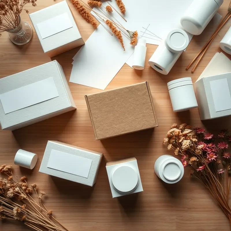
Deriving your palette from positioning, not taste
A reliable way to choose is to write down four things and let them constrain the palette.
1. **Category and hero product.** Sunscreen, acne care, barrier repair, body oil, lip tint and perfume each carry different default cues. Start with the cue, then decide how far to bend it. 2. **Customer and occasion.** A 35-year-old professional buying a night cream and a 19-year-old buying a lip balm at a convenience store respond to different palettes. Write the person down, including where they shop and what else is in their bathroom. 3. **Price tier.** Mass, mid, mid-premium or premium. Premium palettes tend to be restrained and dark or very pale; mass palettes can be louder. Match the palette to the price on the label. 4. **Brand personality in three words.** Calm, precise, warm. Bold, playful, loud. Earthy, honest, slow. Each trio points to a different family of colours.
Now build a palette with roles rather than favourites: one dominant colour that carries the brand, one or two secondary colours for range navigation (for example a different secondary tone per product line), one accent for calls to action and highlights, and one neutral for text and backgrounds. Five colours is usually enough; more becomes noise.
If you plan to start your own brand with several products, test the palette across the whole range on paper before approving any single item. A colour that looks elegant on one serum box can clash when six SKUs sit together in a gift set or a marketplace storefront. Range coherence is where many creator brands quietly fall apart.
Culture, market and what travels badly
Colour meanings shift across markets, and beauty brands made in Thailand often sell across Southeast Asia, the Middle East and beyond. A few differences worth checking before you lock a palette:
- **White** reads as clean and clinical in most beauty contexts, but in some East Asian traditions it carries associations with mourning in non-beauty settings. In practice, white skincare packaging sells everywhere, but pure white with sparse black text can feel cold in markets that prefer warmth.
- **Gold and deep red** signal luxury and celebration across much of Asia and the Gulf, which is why they appear on gift sets and festive editions. Overused, they tip into gaudiness in European and Australian markets.
- **Green** suggests nature and halal-friendly positioning in many Muslim-majority markets, as well as herbal heritage in Thailand. It can suggest medicinal or budget in parts of Europe if the shade is too flat.
- **Pastel pink** is widely accepted for young female audiences in Southeast Asia and Korea-influenced markets, but may limit appeal to men and older buyers.
- **Black** is the default for premium men's grooming and fragrance globally, though some markets associate heavy black packaging with pharmacy or discount lines when combined with poor print quality.
The safest method is to look at what actually sells in your first target market: photograph the shelves and top marketplace listings in your category, cluster them by palette, and decide whether to fit in with a twist or to stand out deliberately. If you stand out, make sure the rest of the design still cues the category clearly, or customers will not understand what the product is.
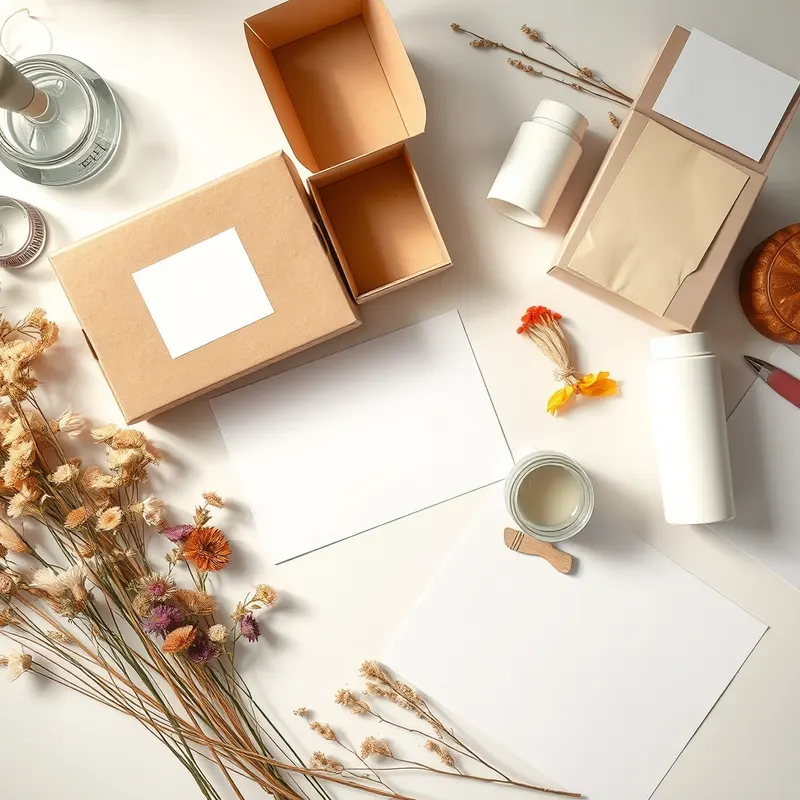
Applying colour to real packaging materials and finishes
Colour on screen and colour on a bottle are different things. The material, finish and printing method change how a shade reads, and this is where private label packaging decisions interact with colour psychology.
- **Glass versus plastic.** Clear or frosted glass lends a premium feel to any palette; amber glass shifts everything warmer and suits oils and herbal lines. Opaque PET and PP take colour well but can look flat without a matte or soft-touch coating.
- **Airless pump bottles and tubes.** These are typically opaque, which gives you a full canvas for colour but removes the visual cue of the formula itself. Use colour to tell the texture story the customer can no longer see.
- **Matte versus gloss.** Matte finishes make pastels and neutrals look calmer and more premium; gloss intensifies brights and suits colour cosmetics. Soft-touch coatings make dark palettes feel luxurious but mark easily.
- **Metallics and foils.** Gold, rose gold and silver hot stamping raise perceived value when used sparingly on a restrained base. A little on the logo works; metallic everywhere looks cheaper, not richer.
- **Label versus direct print.** Labels allow more colour fidelity and small runs; direct screen printing on the bottle looks cleaner but limits colour count and raises set-up cost.
- **Secondary packaging.** The carton is where most colour lives for shelf presence. Keep the bottle simpler and let the box carry the palette.
Ask your manufacturer or packaging supplier for physical colour drawdowns or printed samples on the actual material, and check them in daylight, under warm indoor light and in a phone photo. Marketplace shoppers will only ever see the phone photo. Remember too that a standard first production run of 1,000 units per SKU means every colour decision is multiplied a thousand times, so a few extra days testing is cheap insurance.
Testing your palette before you print
You do not need a research budget to avoid an expensive colour mistake. A few low-cost checks catch most problems:
- **The thumbnail test.** Shrink your mock-up to the size of a marketplace tile and place it among ten competitor tiles. Can you find it in two seconds? Does it look like it belongs to the right category and price?
- **The shelf test.** Print the carton at full size, fold it, and stand it beside the brands it will sit next to in a real store or on a photographed shelf. Note whether it looks cheaper, pricier or simply invisible.
- **The squint test.** Blur your eyes or view a desaturated photo. Strong palettes keep their structure; weak ones dissolve into grey.
- **The range test.** Mock up all planned SKUs together. Check that secondary colours help the customer tell products apart without breaking the family.
- **The audience test.** Show three palette options to eight to ten people from your target group, without telling them which you prefer. Ask what the product is for, how much it costs and who it is for. Their answers reveal what the colour is actually saying.
- **The accessibility test.** Check text contrast against the background so ingredient lists and directions remain legible for older customers and in low light.
Record the results, choose, and then stop changing. Consistency over the next two years will do more for recognition than any single clever choice. Once the palette is fixed, document it: exact print references for each colour, finish specifications and rules for how colours are used across bottle, carton and digital assets. Hand that document to every designer, manufacturer and packaging supplier you work with, and your brand will look the same from the first box to the ten-thousandth.
Need expert support?
Leave your details and our team will get back to you.
FAQ
Frequently asked questions
Should my palette follow trends or avoid them?
Borrow the category cue from current trends so customers understand what you sell, but build the distinctive part of your palette on something that will still feel right in three years. Trend colours work well on limited editions and campaign materials, while the core packaging should stay stable so repeat customers recognise it.
How many colours should a beauty brand use?
Usually one dominant brand colour, one or two secondary colours for range navigation, one accent and one neutral for text and backgrounds. Five is plenty. More than that makes the range look inconsistent and complicates printing, especially when the same palette has to work on glass, plastic, cartons and digital listings.
Does colour psychology matter if I sell mostly online?
Arguably more, because online your packaging is a tiny thumbnail competing with dozens of others and the customer cannot touch the product. Colour is the main cue for category, price and quality in that moment. Test your mock-up at thumbnail size among competitors before approving the final design.
Can I change my packaging colours later?
Yes, but each change spends some of the recognition you have built, and a standard production run of 1,000 units per SKU means existing stock has to sell through first. It is far cheaper to test properly before the first run than to rebrand after launch, so treat colour as a strategic decision rather than a last-minute design choice.
Prepared by the Private Label Thai team for informational purposes. Some links may lead to referred partners.
Articles
Related articles
How to Design a Skincare Box That Stands Out on Shelf: A Founder's Guide
Learning how to design a skincare box that stands out on shelf is mostly about decisions made before the designer opens a file: shelf context, structure, hierarchy, finish and the legal panel. Here is the order to make them in.
Trending Serums to Private Label This Year: A Founder's Buying Guide
If you've been scrolling beauty TikTok or checking out what's moving in salons, you've probably noticed serums are having a moment again — not as a single hero product, but as a ca
How to Test Private Label Skincare Samples Before Launch: 6 Checks
How to test private label skincare samples before launch: six checks covering first impressions, a real tester panel, patch and tolerance testing, packaging trials, shelf-life questions for the manufacturer, and a go or no-go decision.